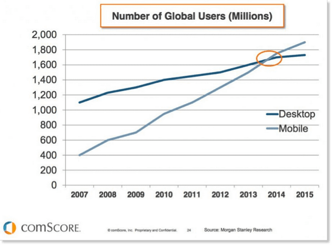
Turns out, Mary was right. With Google confirming early this year that more Google searches take place on mobile devices than on computers in 10 countries, and a comScore study confirming – “the days of desktop dominance are over,” with 60% of digital media consumption coming via smartphone or tablet, and only 40 by desktops (U.S).
So, we’re no longer questioning the need for responsive web design for mobile marketing – it’s a reality. Mobile Internet users are overtaking desktop on a global scale… AND mobile data traffic is only increasing at a rapid rate, as Statista.com show with this predictive graph based on growth thus far…
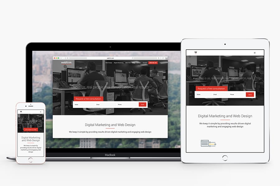
By ‘responsiveness’ we’re referring to responsive web design – a design that accommodates the need for a website to change (respond) according to the device it is being accessed via. For example, if you open our homepage, webfirm2019.webfirmdemo.com.au on your desktop and then on your mobile phone, you’ll see two similar, yet deliberately different pages.
You’ll notice images are resized to fit the smaller screen of your mobile, the navigation bar across the top is compressed to a drop down menu, making it easier to navigate on your mobile, and also the content layout is adjusted to vertically fit a mobile screen with downward scrolling function.
This is all of course because we use a responsive web design, which as we discovered in our previous ironic blog post – “Have you seen Apple’s mobile website?” (since corrected, but still interesting), not all websites are adopting, and they probably* should be!
*This previous blog post also points out the alternatives to responsive web design (namely: Mobile Applications & Dedicated Mobile Websites)
… But one thing we can all agree on is that doing nothing is not a smart option in today’s mobile dominated world.
As Google confirmed in a 2012 study:
With mobile Internet usage only increasing since 2012, people’s expectations of a mobile friendly site would be even higher today!
With everything on your desktop website needing to be squeezed from approximately 1200px to 360px (a loss of around 840px of real estate) – you can think of responsive design as moving your stuff from a 4 bedroom town house, to a 1 bedroom apartment.
Obviously, you wont be able to fit all your awesome eye catchy furniture {images, videos, interactive and responsive widgets, flashy banners} from your town house {desktop website} in to your downsized apartment {mobile website}.
Thus, responsive web designs are generally simplistic, creating a basic standard of website that we are seeing more and more of across the Internet…
Having this ‘standard’ across web design is certainly not a bad thing, as discussed in our previous blog regarding ‘tips for content creation” – it creates an enhanced user-experience where users can navigate your website confidently and comfortable…
With so many different devices like smartphones and tablets now regularly accessing websites, the obvious issue that needs to be addressed from a web design perspective is how to fit the desktop site on to the much smaller screen of the smartphone or tablet.
Essential – Fluid Images & Fluid Grids
In responsive web design, images need to automatically scale to fit the screen of the device accessing them, and similarly, fluid grids need to adjust so that content is scaled to the size of the device. Otherwise, mobile Internet users (a global majority!) have to awkwardly scroll up/down/left/right to get the gist of what is happening on a site that is too big for their screen… creating a terrible user experience!*
*As the before mentioned Google study proved: 61% of users “quickly move on” from a non-mobile-friendly website, and 79% of people who don’t like what they find on a mobile website will click back and search for another site.
It also forces you to focus on the essentials, by eliminating the clutter on your website and focusing on only what you need included to drive your visitors.
At Webfirm, our in-house web designers are well informed on the trends in mobile and desktop Internet traffic, and are thus experienced in creating responsive web designs that accommodate a positive user experience across desktops, smartphones and tablets.
If you think your website could benefit from a responsive web design (if you’re not responsive yet, you need to be!) please contact us today, and let us help you drastically enhance your potential by extending across the dominant mobile audience.
Sign up to get insights & inspiration in your inbox.
3892 people are reading this newsletter every week