This analysis highlights 3 major factors that effect mobile ranking differently from desktop, taken from a comparative study of the top ranking mobile and desktop URLs conducted by Searchmetrics.
Technical – where file size, site speed, the use of Flash influence mobile ranking differently due to the smaller bandwidth and screen size of the devices.
User Experience – the on-the-move accessing nature of mobile devices cause specific design and layout factors like font size, links, unordered lists and images to effect user experience in different ways to desktop.
Content – top ranking mobile URLs content differed in word count, number of keywords and proof terms as well as flesch readability, in comparison to top ranking desktop URLs.
The study concluded that having two separate marketing schemes for mobile and desktop ranking is recommended, and a dedicated mobile site can be beneficial.
A recent report by Searchmetrics studied the differences between desktop and mobile ranking factors, in order to provide insight into distinctive strategies and techniques that should be focused on in order to optimise for mobile search results.
The growing importance of having a mobile-friendly site is undeniable… as Google confirms we have passed the tipping point for mobile enquiries – “more Google searches taking place on mobile devices than on computers in 10 countries including the US and Japan.” Search Engine Land elaborates on the fact that mobile searches now exceeded desktop searches worldwide.
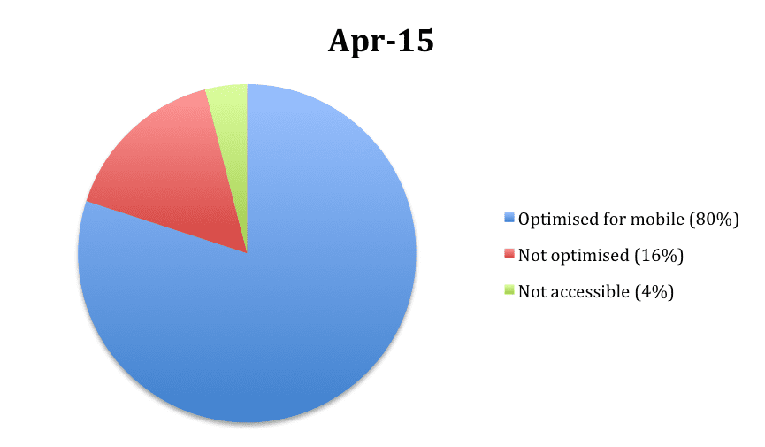
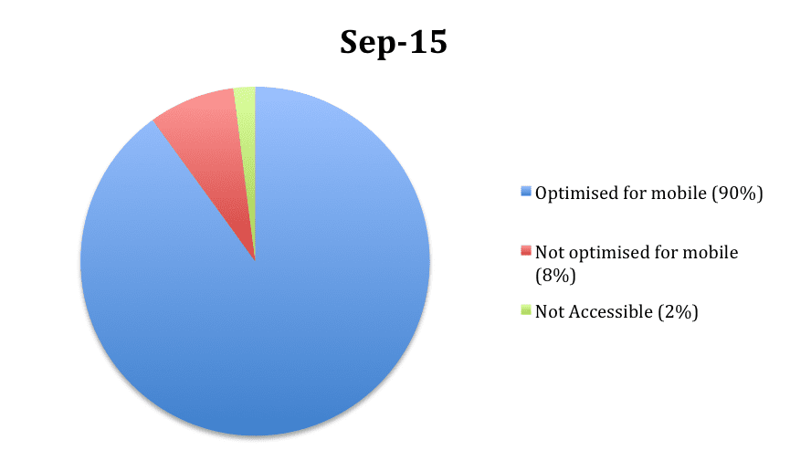
After Google’s so called “Mobilegeddon” announcement in April, mobile-friendliness was recognized as a significant factor in mobile ranking, and there has been a relative increase of mobile-friendly sites in the top 100 domains since.
According to Searchmetrics’ research: prior to the update, 80% of the top 100 domains were mobile-friendly; at last check, 90% of these domains are now optimised for mobile.
Source: Searchmetrics’ Mobile Ranking Factors 2015 Report
Most business’s now understand the importance of having mobile-friendly web design, but largely aren’t aware of the differences in mobile and desktop ranking factors. As such, they take a one-size-fits-all approach to ranking optimisation – and generally only track desktop rankings.
So, should we be following two separate strategies to optimizing mobile rankings and desktop rankings? Searchmetrics’ report suggests, yes. Comparatively studying the highest-ranking mobile and desktop URLs, their report revealed which elements should be focused on to optimise for mobile.
Due to the smaller bandwidth and screen sizes of mobile devices, technical issues have a strong influence on positive mobile rankings. Searchmetrics’ report points out four of the most significant technical rankings factors…
File sizes: The average file size was smaller on the entire top 30 mobile search results, in comparison to the desktop results. Avoid large files on mobile sites, as they create slow loading times.
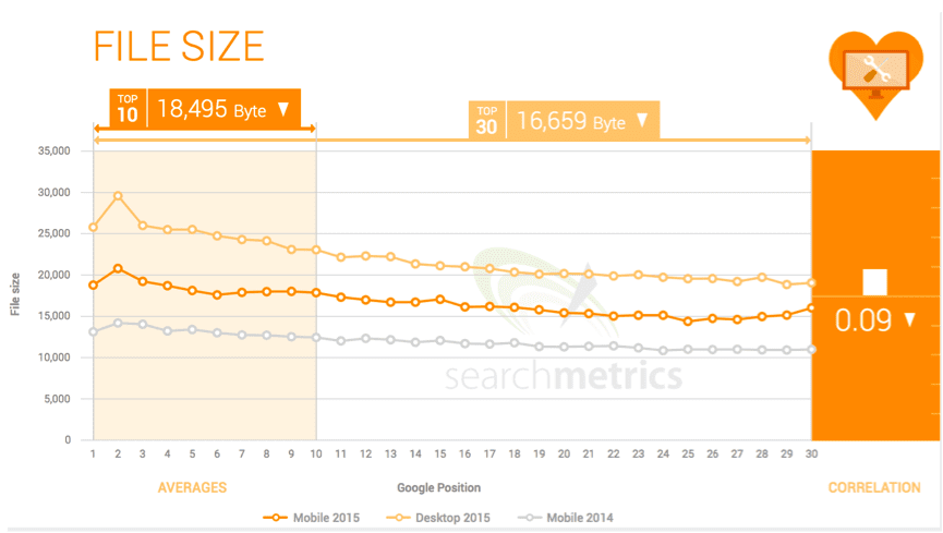
Source: Searchmetrics’ Mobile Ranking Factors 2015 Report
Site Speed: The top mobile pages – because of smaller file sizes – have a faster average loading speed, at 1.10 seconds. You can check the speed of your sites using the Google PageSpeed insight tool.
Flash: Flash elements on mobile search results are decreasing, with only 5% of the top 10 mobile search results integrating Flash. This is because many mobile devices no longer support Flash, and HTML5 should be used instead.
Keywords in Domain: The percentage of keywords in domain is lower on the mobile sites than desktop, with both steadily declining since Google’s “exact match domain” announcement in 2012. Businesses should focus more on branding not keywords when choosing domain names.
Limited display area, and the nature of on-the-move accessing of mobile devices make user experience extremely important. Searchmetrics’ reports suggests four important design and layout factors that uniquely affect mobile-ranking from a user experience perspective…
Font size: Corresponding to the screen size and dimensions of devices, the average font size for content on mobile results were significantly larger above the fold (page visible without scrolling). Using larger font is easier to read on a smaller, mobile device.
Interactive elements: Due to smaller display size, mobile search results exhibit much fewer interactive elements like buttons, menus and links. Placing links too close together makes it difficult for mobile users to accurately click on.
Unordered lists: Whilst high-ranking mobile pages use more unordered lists than high-ranking desktop page, the lists a generally shorter in length. Bullet-points make content easier to scan, but lists need to be shorter in length for smaller mobile devices.
Images: Top-ranking mobile results averaged less than half that of desktop results (Mobile: 4, Desktop: 9). Images should be used more sparingly on mobile pages, as they add to load time.
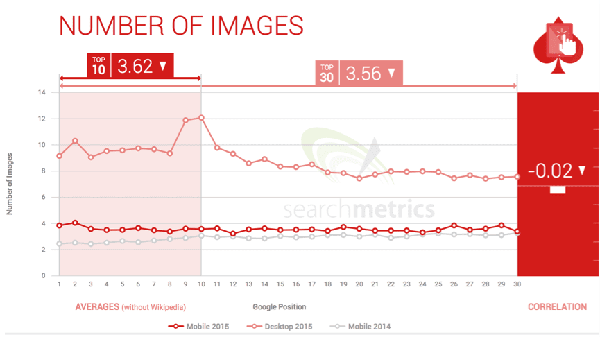
Source: Searchmetrics’ Mobile Ranking Factors 2015 Report
Content continues to be one of the most important factors for good ranking, across both the top mobile and desktop search results. High-ranking mobile content did however differ from high-ranking desktop content across a number of factors…
Word count: Word count is increasing across both platforms, as content becomes more comprehensive, but high-ranking mobile content is still significantly shorter than desktop – averaging 868 and 1,285 respectively
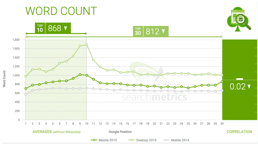
Source: Searchmetrics’ Mobile Ranking Factors 2015 Report
Keywords: Whilst keywords in the body of high-ranking mobile sites rose from 2.7 to 5.48 in 2015, there are still significantly less keywords on average than in high-ranking desktop results (10.22). This can probably be attributed to the smaller word-count, as keywords are an important aspect in both mobile and desktop rankings factors.
Proof terms: Proof terms (terms that are semantically very close to the main keywords) are used slightly more on high-ranking mobile pages, but both devices are increasing proof term value. Writing quality, informative content should naturally include these terms.
Flesch readability: Both mobile and desktop top-ranking websites had readability levels around the mid-70s. Interestingly, mobile results were deemed to have slighter more complicated text… but this can probably be attributed to shorter word counts. Use this readability tool to check your websites score.
Searchmetrics’ comparative study of top-ranking mobile versus desktop URLs proved that factors such as technical, user experience and content affect mobile ranking in different ways to desktop. But what does this mean in practical terms? Should businesses incorporate two different marketing strategies for mobile and desktop ranking?
The report suggests that at the very least, having a responsive design approach to mobile-friendliness is recommended; meaning your website optimized for all devices, and will resize to fit different screens in a functional way. Searchmetrics also highlight examples of websites that have significantly benefited from a dedicated mobile site, such as reddit.com and “m.reddit.com.”
Sign up to get insights & inspiration in your inbox.
3892 people are reading this newsletter every week