(We) bear in mind that the object being worked on is going to be ridden in, sat upon, looked at, talked into, activated, operated or in some other way used by people individually or en masse.
When the point of contact between the product and the people becomes a point of friction, then the designer has failed.
On the other hand, if people are made safer, more comfortable, more eager to purchase, more efficient – or just plain happier – by contact with the product, then the designer has succeeded.
-Henry Dreyfuss
Published 1955, the seminal text ‘Designing for People’ came to define the fundamental doctrines of user experience (UX) design.
In it, Dreyfuss decreed that the creation of any object, product, and service, should consider each and every element that shapes the user’s experience, and that the creator owed it to the user, to create products and features that are relevant, logical and a pleasure to use.
No doubt it may sound a little alien now, that there once was a time when the creation of tools, the construction of factory assembly lines, or the grip of a tennis racquet, weren’t always designed with the carpenter, the factory worker, or with the tennis player in mind.
But, just how it was novel for Archimedes to suppose that the quickest distance between two points was a straight line, these…intuitions had to first have been realised.

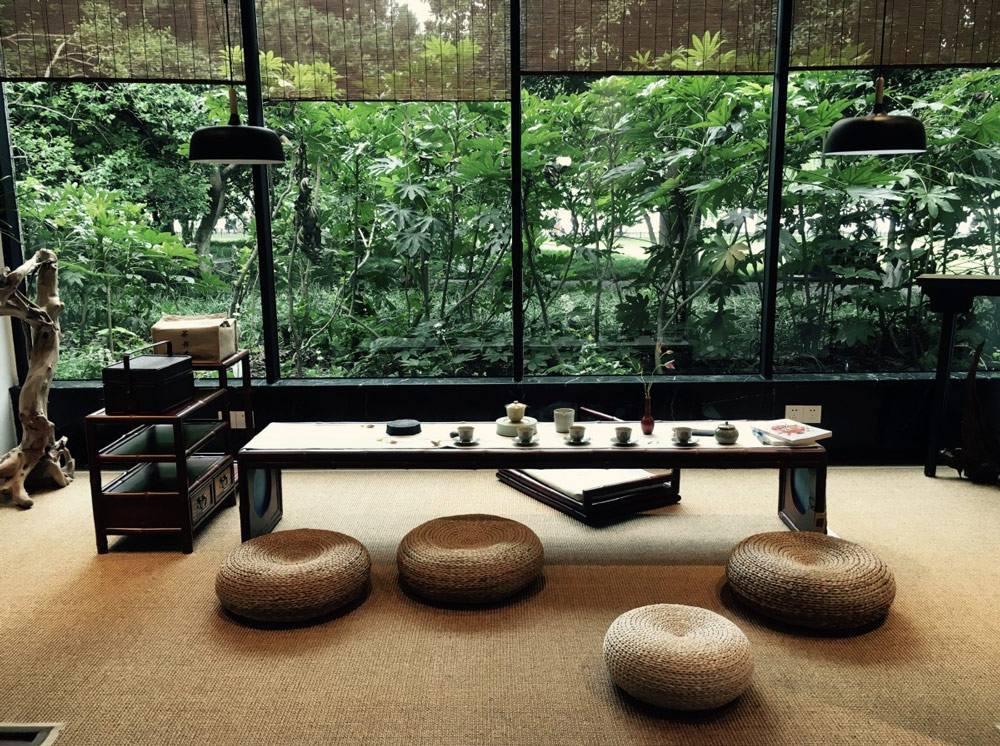
The diversity of styles spread across cultures is testament to these intuitions being learned, honed and specialised over thousands of years of cultural propagation. The Danes have spatial minimalism. The Chinese have feng shui. The Greeks had early ergonomics.
Invention (by its nature) means something novel has been created. And as the saying goes, often- it is mothered by a specific necessity. Say, for example, the need for a flat surface on which to prepare food brought about the invention of the table.
Why then, when we go furniture shopping, do we not just purchase the simplest table design available? Four walls and abode slats should do?
We choose something we like the look of, that has a nice colour, a beautiful design, that fits with our existing furniture or belongs to a trend of the moment. We do this because the pure function of an object is not the only factor that contributes to its worth. And, the expression of taste allows us to shape our surroundings in a way that reflects our personalities.
It’s why we prefer Kirk over Spock, why university Jazz students cop it, it’s why Target’s t-shirt collection is only ever worn to bed and why Michael Bublè is…well…Michael Bublè.
We are concerned with more than pure functionality. Our lives are enriched when we surround ourselves with beautiful things.
Aesthetics are determined by how all of our senses interact with an object, product or service, and therefore is less of a singular aspect, or look, and more of an experience. To understand aesthetics we need to first understand the difference between a functional & pragmatic approach, and its counterpart.
To be pragmatic is to look for a means to an end. The focus is on use and in understanding simple equations of cause and effect. Whereas, aesthetics deal more with a user’s relationship with and feelings for a given experience. It is sensory and emotional. The focus is more on involvement and interaction. The aesthetic experience is an immediate one, and it invokes the user to be absorbed and present; to enjoy themselves.
Aesthetic design focuses on form rather than content and creates a world in which the means and the end are inextricably linked.
The ‘halo effect’ (See here) is the human tendency humans have to assume that good looking people possess other positive qualities aside from their looks. The same concept can be applied (broadly) to product design. We perceive good looking, beautiful products as more valuable.
Dating back some 6,000 years, Feng Shui literally translates as wind and water and refers to the spatial arrangement of objects (famously, furniture) in relation to the flow of energy (chi). In practice, Feng Shui is all about arranging your surroundings in the most optimal, harmonious or user-friendly way— be it an office, bedroom or entire building. It concerns everything from layout and framework to materials and colours.
Just as an interior designer might arrange the furniture in a way that makes it easy for the inhabitant to navigate the room, a UX designer would apply similar principles to the task of creating a mobile app.
The end goal is essentially the same- to create an intuitive, fluid and harmonious living experience.
An early precursor of UX can also be traced back to Ancient Greece. There is evidence to suggest that, as early as the 5th century BC, Greek civilizations designed their tools and workplaces based on ergonomic principles.
According to the International Ergonomics Association, ergonomics—or human factors—is “the scientific discipline concerned with the understanding of interactions among humans and other elements of a system, and the profession that applies theory, principles, data and methods to design and optimize human well-being and overall system performance.”
One of the strongest indications that the Ancient Greeks were well aware of ergonomic principles is the way that Hippocrates described how a surgeon’s workplace should be set up. He refers to the lighting in the room, the surgeon’s positioning—“the surgeon may stand or be seated, in a posture comfortable for him”—and the arrangement of tools; “they must be positioned in such a way as to not obstruct the surgeon, and also be within easy reach when required.”
Around 1430AD, the Duke of Milan commissioned da Vinci to design the kitchen for a high-profile feast. The great Maestro took the job on with his usual inventive flair. In what is considered the first use of the technology (hundreds of years before the Industrial Revolution) da Vinci designed and employed conveyor belts to transport food items to the preparers. He also built what is likely the first sprinkler system for safety measures.
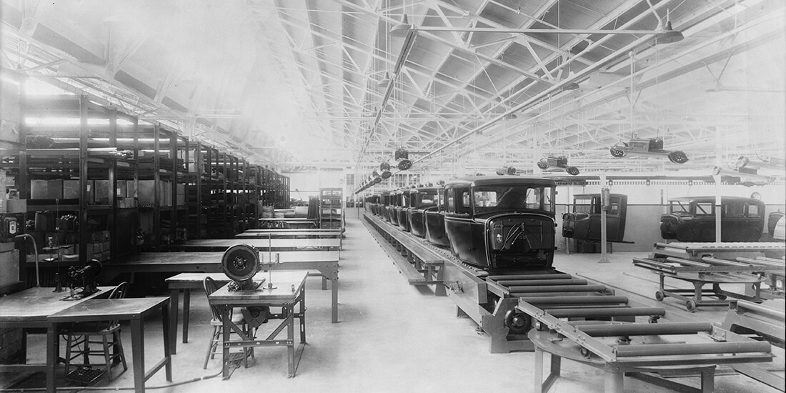
Frederick Winslow Taylor, a mechanical engineer and one of the first management consultants, authored “The Principles of Scientific Management,” a widely influential study of engineering efficiency. Along with Henry Ford’s pioneering mass-production techniques, Taylor and his supporters shaped the early vision of what interactions between labourers and their tools should be like.
While Toyota, valued efficiency in engineering and production, it also sought its employee’s input. The assembly workers’ contributions were valued greatly—almost as much as the technologies used. The roaring success that Toyota experienced in the late 1940s as a result brought new attention to the role of human interaction with technology.
Dreyfuss, a pre-eminent American industrial designer, published the classic text “Designing for People” in 1955, in which he outlined some revolutionary design principles, which include today’s oft-invoked concept of delight, and these ideas have only grown more relevant as the points of contact between product and persons have proliferated.
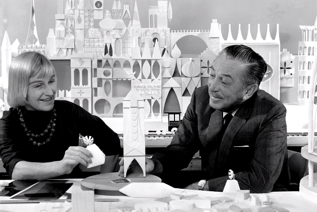
In a very early-stage announcement of what would later become Disney World, Walt Disney described the project as “always in the state of becoming, a place where the latest technology can be used to improve the lives of people.” His imaginative use of technology to bring people joy continues to inspire user experience designers.
Xerox’s famous research arm, PARC, gave form and function to the design of computers for human use. Bob Taylor, a trained psychologist and engineer, led his team in building some of the most important and enduring tools of human-computer interaction, including the graphical user interface (GUI) and the mouse.
An electrical engineer and cognitive scientist by trade, Don Norman joined Apple to help with the research and design of its upcoming line of human-centred products. He asked to be called “User Experience Architect,” marking the first use of the term in a job title.
By this time Don Norman had also written his classic book, “The Design of Everyday Things,” which championed design for usability and functionality rather than aesthetics. It remains hugely influential for designers today.

However, when people use the term UX, they’re usually referring to one’s experience with a digital or technological product or service.
Steve Jobs unveiled the iPhone at MacWorld 2007, calling it a “leapfrog product” that promised to be far easier to use than any other smartphone on the market. Not only did it deliver on its promises, but it changed the landscape of mobile devices forever, catapulting Apple into its current position as one of the world’s most successful companies.
The genius of the original iPhone, arguably, lay in its fusion of superior hardware and software to provide connectivity through a revolutionary capacitive touchscreen, making the physical keyboards of other phones obsolete. Put more simply, it provided a user experience far superior to that of any other contemporary phone.
Every major milestone in the evolution of UX has involved an interaction between technology and human beings. As technology and the internet continue to weave themselves into our lives, we can expect to see UX continue to evolve. This will bring to light the need for more specialised skills in multidisciplinary practice, including user research, graphic design, customer advocacy, software development, and more. With the emergence of VR and AR technologies, it becomes more important for digital designers to consider the 4D experience too.
The graph below shows the estimated number of global UX professionals from 1950, projecting to 2050

The most successful companies know there are compelling reasons to prioritize design to improve the odds of success. Good design creates meaningful first impressions, helps you differentiate yourself from your competitors, can solve problems, and boosts brand awareness and the bottom line.
We have short attention spans…and they’re getting shorter! A 2016 Princeton University study found after seeing a face for only 1/10th of a second people formed opinions about that person. Judgments were made on attractiveness, likeability, and trustworthiness, and prolonged exposure to that face just reinforced the initial impression.
The same goes for websites. Three studies found that a mere 50 milliseconds were all people needed to form an opinion about a website. Google performed similar testing and found an even slimmer margin: a speedy 17 to 50 milliseconds were all people needed to decide how they felt about a website.
The results show that visual complexity and play crucial roles in the process of forming an aesthetic judgment. It happens within incredibly short time frames between 17 and 50 milliseconds. By comparison, the average blink of an eye takes 100 to 400 milliseconds.
When people first encounter a website or marketing campaign a number of questions go through their minds:
Think about what kind of the first impression you want your customers to have. If you want to appear reliable and trustworthy, make sure your website design is clearly laid out and uncluttered. Want to seem fun and exciting? Look into bold colour choices and use imagery that has energy. Informative and useful? Put content upfront and make it easy for people to navigate and find.
Effective design can go a long way in making sure your customers’ first impression is a good one.
Recent marketing studies show that the average consumer is exposed to roughly 5,000 advertisements and brands per day. And, all things being equal, we perceive beautiful things as being better, irrespective of whether they indeed are.
This is because we appreciate beauty. We are charmed, and persuaded by it.
And, just as in nature, function can (and should) follow form.
Sign up to get insights & inspiration in your inbox.
3892 people are reading this newsletter every week