Why? Well, we’re glad you asked.
Research into the link between colour and advertising has found that 90 per cent of product assessments have to do with colour, and 85 per cent of buying decisions are determined by how colour is used both on the product itself and in the marketing collateral.
So, based on this assessment alone, you’d be pretty safe to assume that the colour scheme you choose when building your website will play a big role in how well your site is received by your target market, and how likely it is that your design will convert users into paying customers.
This assumption is 100 per cent correct, however, the specifics of how this all works is a little more complicated, and it all has to do with colour psychology.
Before you freak out at the sight of the word ‘psychology’ and jump ship thinking you’re about to be hit with a huge scientific article, just hear us out.
In its simplest form, colour psychology is the science of how colour affects human behaviour. The main point we want to outline here is that it takes the average customer roughly 90 seconds to form an opinion about a product and 62-90 per cent of that interaction is determined purely by the product’s colour.
This means that your website’s colour scheme is extremely important, both in regards to its visual appeal and its potential to encourage a higher conversion rate, and in turn, a stronger ROI.
Before we look at what specific colours mean in relation to your website, let’s first look at how your website’s colour scheme will be perceived by your target market.
Firstly, there are a few common sense principles that should be applied when choosing a colour scheme. For instance, if you’re operating an eCommerce toy shop you’re not going to use black, you’re going to opt for bright, playful colours that we generally associate with children and toys. However, if you’re a luxury hotel, colours like black and gold will likely be up there on your list of options.
But, most importantly, is your target market male or female?
The sociological differences between colour preferences is an entire area of study in itself, however, research has shown that men and women tend to prefer and dislike a specific set of colours.
A survey on colour and gender has revealed that women prefer blue (35 per cent), purple (23 per cent) and green (14 per cent), while 33 per cent of women confessed that orange was their least favourite colour, closely followed by brown and grey.
So, if your target audience is predominantly female, it’s best you avoid colours like orange, brown and grey and instead opt for blue, green or purple.
When marketing to men, try to avoid colours like purple, orange and brown (orange and brown are just unpopular in general), and aim to use shades of blue, green and black.
These options aren’t too surprising, as they’re typically colours associated with men.
Now that we know what colours men and women prefer, let’s take a look at the connotations of different colours and how they can affect your website’s overall performance.
Have you ever noticed that sites like PayPal, Facebook and Linkedin all use blue colour schemes?
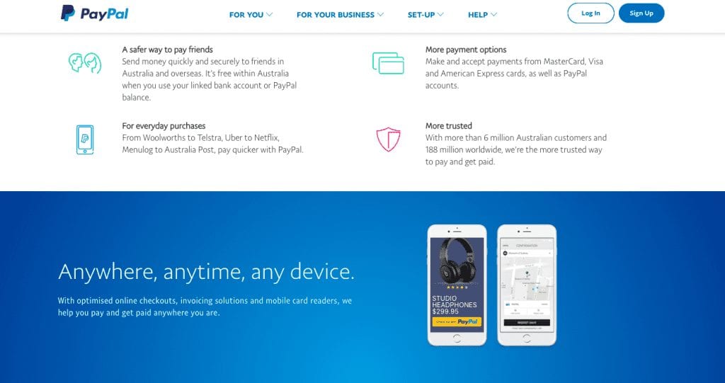
Well, as it turns out, they didn’t just decide to use blue because it looks good, the decision process was much more in-depth than that. Okay, it’s actually not that complicated… blue is the most used colour because people really like it!
It’s also cited as being the colour of trust, peace, order and loyalty, and evokes feelings of calmness and serenity. Considering the world’s biggest social networking company (Facebook), who has core values of transparency and trust have chosen the colour blue to represent their brand, it’s safe to say their colour selection isn’t a happy coincidence.
There are conflicting views on what the colour yellow represents, however, since it’s commonly used for warning signs, traffic signals and wet floor signs, a yellow website can be misconstrued as dangerous.
However, colour psychologists also claim that yellow represents happiness. This is why a lot of brands who want to come across as fun and friendly incorporate yellow elements into their web design.
The science behind people’s feelings towards yellow is actually quite interesting. The colour yellow has been proven to stimulate the brain’s excitement centre, so when yellow makes you feel happy and playful, it could just be that you’re experiencing heightened emotions and responses, rather than sheer joy.
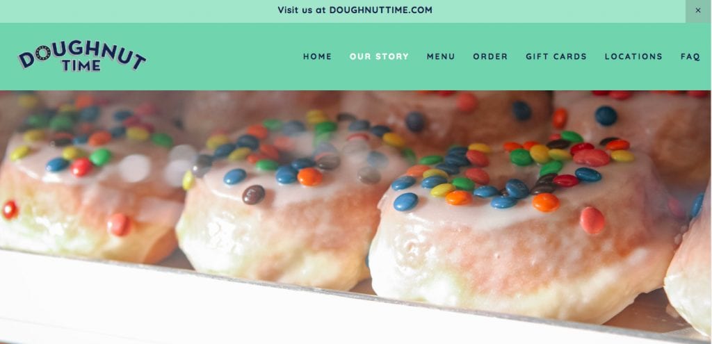
The colour green is intrinsically related to the outdoors, which is why a lot of recycling, environmental and outdoor-related businesses incorporate it into their professional branding.
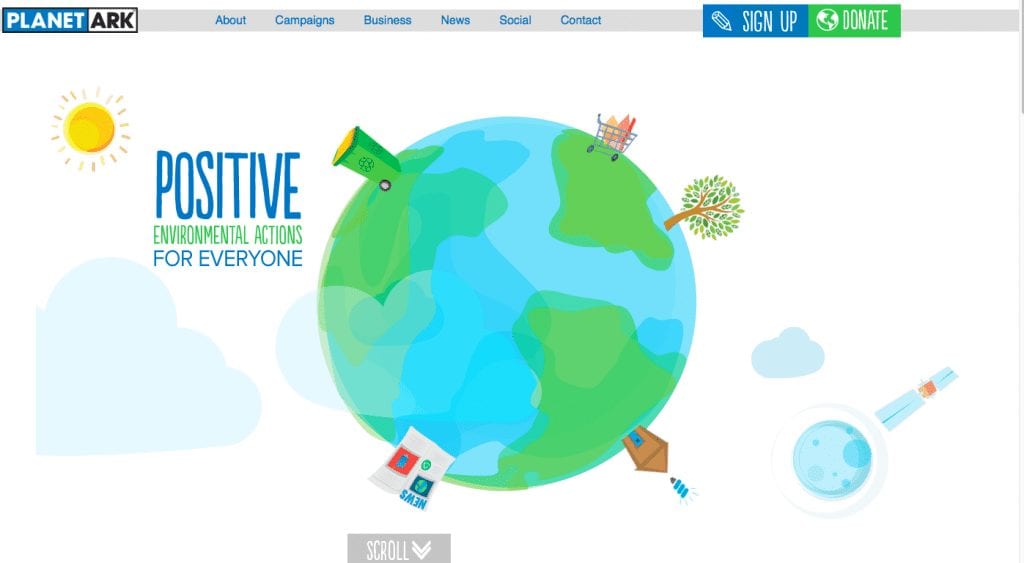
So, unsurprisingly, if you’re running a business that has anything to do with nature, the environment, organic practices/products or the outdoors, green should be your colour of choice. This is because it makes your business’s mission statement immediately clear and it appeals to both a male and female audience.
However, if you’re a fan of green and aren’t part of any of these industries, different shades of green, as mentioned above, are favoured by female users, while research also suggests that having a call-to-action in a colour that stands out, such as green, is also ideal (but we’ll get to that in more detail a little later).
Orange, although not a favoured colour by men and women alike, has been linked to feelings of stimulation, especially in terms of physical activity, competition and confidence. Because of this, it’s a popular colour among sports teams and for children’s products.

Orange also creates a sense of urgency, which is why it’s a great choice for sale banners, limited time offers and call-to-actions.
However, when using orange to draw attention to something, make sure you only use it sparingly.
According to colour psychology, the darker something is, the more lux it is.
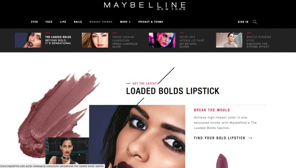
Black can be described as ‘elegant, sophisticated and powerful’, which is exactly what high-end eCommerce sites and luxury designers want you to feel.
When used correctly, like the above Maybelline example, black communicates glamour, sophistication and exclusivity.
A call-to-action needs to stand out, so when people visit your website, you want to instantly draw their eye to key points, like ‘buy now’ or ‘contact us today’.
Therefore, the best colours for increasing a website’s conversion rate are bright, primary and secondary colours, like red, green, orange and yellow, while darker, more neutral colours like black, dark grey, brown and purple have significantly lower conversion rates.
I am text block. Click edit button to change this text. Lorem ipsum dolor sit amet, consectetur adipiscing elit. Ut elit tellus, luctus nec ullamcorper mattis, pulvinar dapibus leo.
So, as you can see, there’s a lot to think about when choosing your website’s colour scheme. However, you don’t need to make these decisions alone. The conversion rate optimisation specialists and designers at Webfirm Melbourne will be able to help you choose the best colours for your website, ensuring both aesthetic appeal and functionality.
Sign up to get insights & inspiration in your inbox.
3892 people are reading this newsletter every week